This Week
I jumped into the water with a distribution plot and found one of my old friends, the picture control. I have used the polar plot UI control for a previous project. I remember how I had to use the “drivers”, or the SubVI library, and recreate my own SubVI’s for my particular functionality needs.
For the Makeover Monday Crowd, a SubVI is a seperate piece of code that can be reused, or called, by other code. It is not unlike a function, it can be small and have very specific and concise functionality, or a SubVI can have as much functionality that it could be like a main code piece. A VI, in general, is a piece of code that exists as it’s own file. SubVI is a term used for a VI that is smaller and specific in its functionality.
UI Functionality and Code
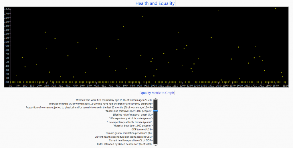
The UI is a straightforward picture control, listed in the pallett as a distribution Plot. It was not until I dropped it on my front panel that I realised it was a picture control with a helper SubVI.
I also used a Vertical Pointer Slide, which is a numeric front panel control, so that the used can select the data set to display. I set this control by reading out the headers and using their names to set the possible values in this control. In this way, if the data set changes, the code doesn;t have to update in order to display whatever data sets are available.
The reading of the data file uses a technique I have stuck to lately, that is to evaluate the data at the edge of the file read, and place it into a format that makes display easy. In this case I decided to to use a three dimensional array, where each page is a year of data.
Design Options
This data set came up with a lot of potential. The daily ins and outs of the job precluded me pushing through the full options.
For example, a dial for each year could be added to show the respective sets of plots.
Ideally the data points with empty values should be filtered out of the data set.
The big picture would be to update the picture SubVI sets to expose all the features of the plot that we would want to have. This would include colors, plot point sizes, and most importantly, the ability to put text into the x-axis, that is, the country names.
The SubVI set, of what I like to call the driver set, only exposes a limited set of setable features. Perhaps this control was meant to be used as a probability distribution plot, in which case it would not be the best choice for this data set. I might expect there to be some additional utilities or SubVI’s to calculate probability results, but could not find any, if that was even the intention. Live and Learn.
However, the distribution plot being a picture control is a great segway into using picture controls on some of our upcoming data sets. Also a hint to myself to pick my controls to match the data. But … I am keeping with the feet first, take a week only approach to these data sets for the near future. Fun, furious, and I find it to be a good learning method.
The Code
Source Forge:
https://sourceforge.net/projects/data-world-labview/files/3-3%20Health%20and%20Equality/
Finale
Short code, not such a great visual. It would have taken a lot of time to properly use the picture code to display this data set in a Data World quality way. Moving on to the next data set, but keeping the picture control in my back pocket to pull out for a upcoming data set.