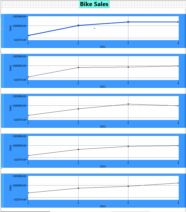
This weeks data set from Data.World was a nice yearly trend showing declining bike sales, a seemingly straight forward data set.
I figured I’d use a Front Panel control that I’ve never used, really, I’ve never noticed it sitting there, hiding innocuously on the graph pallet.
Big Mistake.
UI Functionality
The idea was to have the XY Plot Matrix, lets just call it the “the graphs”, use it’s ~apparent~ functionality.
That is, to setup the data so that each automatically generated graph would be one year. Then I would loop through each graph and set all the parameters. In addition, would make some color coding of the plots to show the declining sales.
Design Challenges
Unfortunately, the graphs is really just an X-Control.
For the Data.World crowd, an X-control is a UI element that has some programmed functionality and behaviors. In this case, the “XY plot Matrix” is supposed to build a chart for each X and Y combination of data. So in our case, I wanted there to be a set of sales for each quarter crossed with each year there is data. This would create a plot for each year, and would allow for the data set to be expanded or shrunk.
It turns out this X-control, the graphs, is not a complete product. After searching NI.com I found only six hits while searching the forums for this graph, and only one article actually about this control.
I assumed we cold step through the graphs, by using the graph position to select each graph, and then use property nodes to set the UI elements of each graph.
The X-control gives no touch points on any of the graphs, only the first graph. So it is a complete bust. Some elements apply to all the graphs, such as the X and Y axis labels. So you can’t programmatically set those per graph, so no way to indicate what year each graphs X-axis data is.
Otherwise, some of the properties only affect the first plot, so you can’t set the line thickness, et al …. , for any of the other plots.
Finale
It would be a challenge to dig into this X-control, but if I were to do that, I’d rather make my own X-control.
As was mentioned in one of the NI forum posts, it would almost be easier to just manually control a set of graphs off screen, and have them fly in as needed, and then set their individual properties.
The experience was frustrating, because the idea of Data.World is to present the story that the data tells in a compelling, visual, and intuitive way. This week I wrestled with the ‘cast off control’, and although I learned a bit, I felt like I was not able to focus on UI elements.
Ultimately I had to finish, and manually “Gussy up” the graphs for a one time screen shot, and move on to next weeks data set.
The Code
https://sourceforge.net/projects/data-world-labview/files/2-25-2019%20Declining%20Bike%20Sales/