This week I focused on using an intensity chart, which I have not used previously. It is an interesting way to display data, not sure if I am a big fan or not. I like that it can show three sets of data, but it was not as friendly as I thought t would be. I look forward to using one again in another Makeover Monday.
UI Functionality
In this weeks UI there are no action buttons for the user. I wanted to put in a dial that would allow the user to select the data column from the data set, to display on the Z axis. This would require repopulating the XY array with the new data, and re-sorting the data.
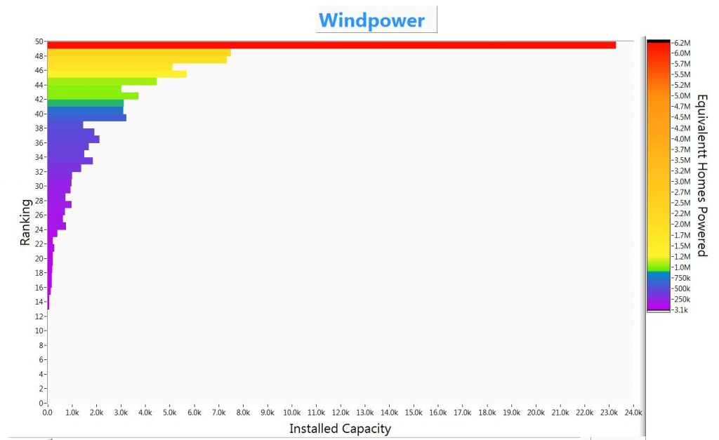
The data set has the rank of the state the same as the “equivalent homes powered”. So changing the Z-data would really show contrasts with the rank (equivalent homes powered)
There are some “off screen” controls that allow the developer to update the levels of the intensity markers.
For the Data.world crowd, the intensity markers are the values in the intensities (Z axis) and the colors associated with those values. I have set the graph to interpolate the colors along the z-axis, so these markers allow a developer to redraw the graph intensities in order to make trends stick out.
This graph, like the article ( https://howmuch.net/articles/wind-power-in-the-united-states-2018 ), shows that the equivalent homes powered doesn’t track exactly with the installed capacity. On this graph the bars (capacity) are not in order but the intensities (houses powered) are.
Data Challenges
I should have changed the Y-axis labels to display the investment values instead of just the rank. LabVIEW doesn’t seem to have a good way to make multiple axis labels, in order to be able to show values and text together. I’ll have to check to see if this can be done using ‘regular expressions’
Similar to last weeks data , I found the range of the data, in this case the equivalent homes powered, to be so large that it was hard to showcase the lower values when the highest value was orders of magnitude greater.
The Code
Code: https://sourceforge.net/projects/data-world-labview/files/2-18-2019%20Windpower/
Design
I spent a lot of time getting used to the intensity chart. There is a ‘developers version’ of the main code. It has a lot of ‘switches’ in the code to play around with. The final version has a clean block diagram.
For the Data.World folks, the block diagram is the code, it is where the graphical program is drawn.
I used a While loop to keep the chart active, so the developer can update the markes list and its colors.
Finale
After reviewing this all I can say I am looking forward to my next intensity chart, so I can focus on the data and telling the story.
Also thinking about using a 3D graph, I haven’t used one in quite a while.