This Week
Crazy busy travel schedule. Comparing three metrics for consumer behaviour during respective national holidays.
For the data.world and makeover monday folks, a ‘snippet’ is a png picture of your code, that contains the code, and can be dropped in the program environment (IDE) and puts the code into your current program. Kind of a cut and paste of code.
UI Functionality
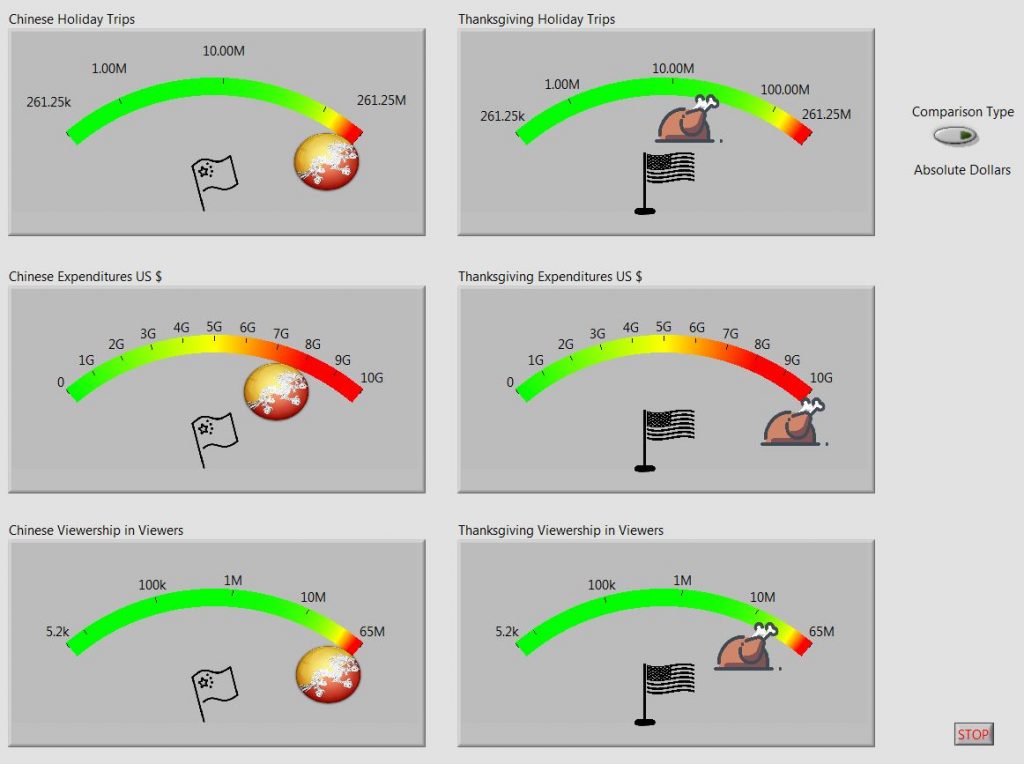
I was inspired by the original graphics, https://www.statista.com/chart/3246/how-chinese-new-year-compares-with-thanksgiving/
so I was looking for a control that might have a round look to it. My first thought was to used meter controls , and so I stuck with that approach.
I replaced the pointer and center pivot with images to match the holidays. It retrospect, I should have looked to see if the meter display could be stretched into more of a complete circle rather than just a limited arc.
Because of the numbers involved, I choose to display two of the meters in logarithmic scale. I’m not sure if the average person reading an article would comfortable visualize the scales involved this way. However, the dial seemed very limited in its ability to display a nice, wide range of values, so in two cases, te display of one of the meters appeared to be zero.
In addition, I added a switch, to scale the values by the number of 1 million peoples in the samples, a sort of per capita of 1 million people. I didn’t see a large change in what was displayed, indicating that in both absolute dollars and in per capita, the relative differences between the two countries was the same. This was all based on how the graphs looked, so maybe quantitative measures could have told that story, but talk about scope creep.
Data Challenges
I didn’t think about the actual differences in sheer values, and how these would affect the meter control’s display. So part of the lesson is to cleanse and evaluate the data prior to designing the display. However, the spirit of these lessons that I am using is to jump in head first, rather than treat the effort as a paid gig.
This affected me because the way the meters were displaying the data, the low values looking like zeroes, I spent some cycles troubleshooting the code.
I even went through the effort of programatically scaling the meters with high and low values. Turns out the low values still displayed in a way to look close to zero even though they were large numbers, but small numbers compared to the max. Thus the Logarithm ended up being a programmer’s choice, but maybe not a best “viewers choice”
Design
This ended up being a simple read, analyze, and display. I used an event structure that only looks for the switch change. So, possibly overkill, but I think I am going to keep this approach, rather than polling, even on simple displays. I also made a snippet for the simple “empty” event structure.
I left the programmatic updates of the meter min/max values sitting like an bump on a log in the code. In retrospect, I would have evaluated the data challenges, and created the min/max values in the data read step, and passed them on in cluster to be used in the programmatic update of the meters.
The Code
Source Forge : https://sourceforge.net/projects/data-world-labview/files/2-4-2019%20Chinese%20New%20Year%20and%20American%20Thanksgiving/
Finale
Time to run on to next week and catch up. Meters are fun, but I need to explore updating the display to stretch further. With time I would have updated the switch to have a different visual element than a switch push button.
LabView shows it’s quirk in importing a field in quotes that has commas in it. It doesn’t recognize the quotes, and treats each commas as part of a CSV. Maybe there is an openG file loader that sees these like SQL does.