This week I got stuck on business travel for five days, so I got a late start on the Data.World data set. I cut off on Tuesday, giving myself two extra days.
UI Functionality
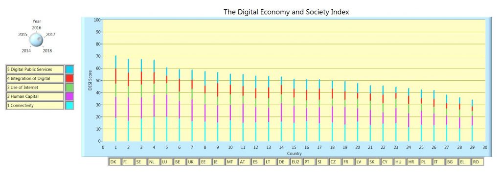
I wanted to use a knob and a XY graph. The data set is challenging because there are five “dimensions”, or metrics, per country, and five years of data.
My thought was to have a knob to display the year of choice, in order of largest composite score. Then have a second knob to set the order of the largest value of a selected indicator score, including the composite score. I ran out of time on the second knob. Details on how this would be implemented is below.
I set the knob to show the year instead of a standard number. This is all native functionality.
Data challenges
The data is in text and numbers. I started out by focusing on the numeric values, not realizing that I would have to account of keeping track of the country name.
In addition, I have to calculate the composite score, and store it by country and year too.
I ended up using clusters to hold the data that I wanted to display or manipulate. This is much easier than running parallel arrays, for numeric values and for text values.
For the Data.World crowd, Clusters are like containers, they can hold all sorts of data types, text, numerics, arrays and more.
The design
There is a file I/O function. In it I also perform some small calculations to provide meta data later on. As an Aside, I think I will start creating more meta data functionality blocks. I noticed this is becoming more and more needed as I progress through these exercises.
After I/O the data is manipulated to create the composite score, and then to sort by that value, for each year. To do this you also have to keep track of what number goes with what country, this is where clusters come in handy.
The next step is to prepare the graph. For this data set, I had to create a plot for each indicator of each county, for each year. So, having the value of each indicator is not enough, I had to create the points that are the stacking of the individual indicators on top of each other, in size.
Once the graph and data are ready I set up a loop so that when the knob changes, the graph is updated with the data from the respective year. I calculated the yearly data sets, and stored them in an array by year. This way we are calculating the data organization once, only having to display it thereafter.
The second knob I didn’t get to would have been selecting the indicator value, including the composite score, and having the graph order the data by that value. Currently it only sorts by composite score. To do this, it would have been the same exercise, that is, create all those plots, and then store them. I would have used a 3D array, where the pages were years, and the rows would have been the indicators.
The article & Code
https://ec.europa.eu/digital-single-market/en/desi
https://sourceforge.net/projects/data-world-labview/files/1-7-2019%20Freedom%20of%20Press/
Finale
I hope you enjoy the code. There was some hard coded elements due to time restrictions. I’m looking forward to starting to customize the native UI elements. Time permitting I should start to get these worked into the weekly routine.