10 Downing Street energy usage, the new data set for Makeover Monday. For this week I decided to use a waveform graph.
For the Data.World crowd, a waveform graph in LabVIEW will take and display a data type called a waveform. This data type, a container of sorts, contains a starting date/time, the time interval between points, and an array of data points.
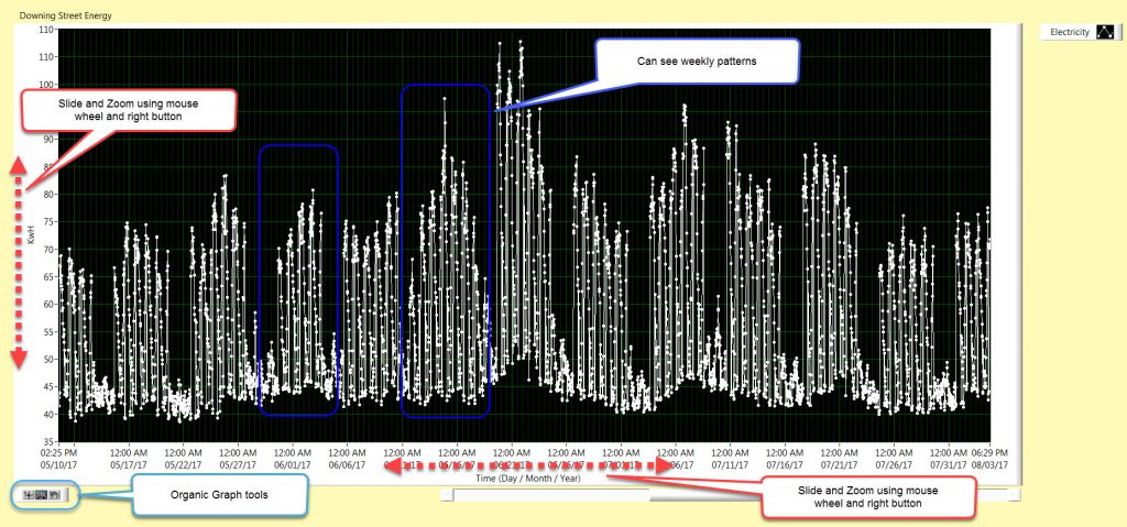
Although I have usually used the waveform for scientific data, it seems like a good fit for data set that is based on a calendar.
UI Functionality
The graph comes standard with it’s organic graph controls. Mainly types of zooms. I wanted to add in the ability to translate or zoom using the mouse.
When the mouse pointer is hovering over either of the values of the graph axis the mouse can then control the graph view by the use of the wheel. Scrolling the mouse will move the data to the right or left, translated. If the right mouse button is held and the scroll wheel is moved, the graph will zoom in or zoom out at that point.
File Data
I noticed the data is provided missing the first energy value, and also sorted alpha numerically in the half hour column a second level sort after the calendar day sort , so that in any day, the half hours are not in order. They go .5, 1, 1.5, 10, 10.5, 11 ….. 2, 2.5, 20, 20.5 , …… So they have to be sorted. I decided to just fill in the one missing energy, rather than go through all the hoops of data validation, where I would discover missing data an most likely put in an interpolated value or discardit as bad data.
Development
There is a lot of effort required to know where the mouse is in relation to the graph axis values. All of this is made more interesting based on where the graph is in relation to the origin of the front panel.
My effort to implement the zoom feature of the mouse involved determining the two distances from the mouse to the ends of the axis location, i.e. the top and bottom of the vertical (y) and the left and right fo the horizontal (x). I got it mostly correct, but I seemed to have missed a subtlety. The graphs also translate a bit while they zoom. It is much more evident in the x-axis, the calendar date/time. I think it is more evident as this value is stored as the number of seconds since 1900.
I’ll have to come back at some point a figure it out.
Code
Sourceforge: https://sourceforge.net/projects/data-world-labview/files/1-21-2019%2010%20Downing%20Street%20Energy/
Finale
This weeks UI was a single element. I focused on the mouse zoom and translation. I probably should have spent more time with pen and paper to really map it out, mental note to self. But .. having gone with the more relaxed approach, I ended up using more troubleshooting efforts, tracking values in the code using probes.
I wanted to make the x-axis, the time, to be more like the original chart from data.world. It was my plan to make the zooming go from one year, to zoom to one quarter, to zoom to one month, and then to one week. So it would not be an analog zoom, like the Y-axis, but more of a discrete steps zoom.